“In all their glory”: Amsterdam civic guards portraits – (1) Humble beginnings

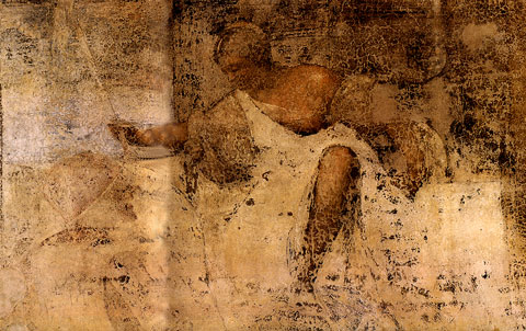
Dutch civic guards group portraits of the 17th century are world famous both for their artistic merit and as a genre unique to art. Invariably we see in these incredibly large paintings men dressed in all their finery, posing formally or seated around a table enjoying copious festive meals. A unique summer exhibition in Amsterdam’s former Town Hall, today the Royal Palace, has united several Amsterdam civic guards paintings in their 18th century location following the description by the city appointed painter/restorer Jan van Dyk (c. 1690-1769). What makes this exhibition even more unique is that it is held in two rooms on the third floor of the Palace that have not been open to the public in two hundred years: the Large and Small War Council Rooms (fig. 1).

Panorama overview of the east wall of the Great War Council Chamber in the Royal Palace Amsterdam. Photo: Stichting Koninklijk Paleis Amsterdam

1. Panoramic overview of the exhibition “In All Their Glory”, showing the east wall of the Large War Council Chamber in the Royal Palace Amsterdam. Photo: Stichting Koninklijk Paleis Amsterdam

The exhibition is an excellent opportunity to explore Amsterdam civic guards portraits in more detail. In this first post: artistic and historical origins. As we shall see, the artistic beginnings were humble. In addition, early civic guards portraits are generally poorly preserved, a fact that was noted as early as 1653 when Gerard Schaep writes: “An old piece. In which my great-grandfather Jacob Schaep Pietersz is in the foreground. But the painting is becoming unrecognisable because of the flaking.” I nevertheless think it is worth while to trace the artistic and historical background of this unique genre of paintings.

Jerusalem pilgrims

Amsterdam Jerusalem Pilgrims, anonymous, c. 1520, oil on panel, 99x23 cm, Catharijneconvent Utrecht

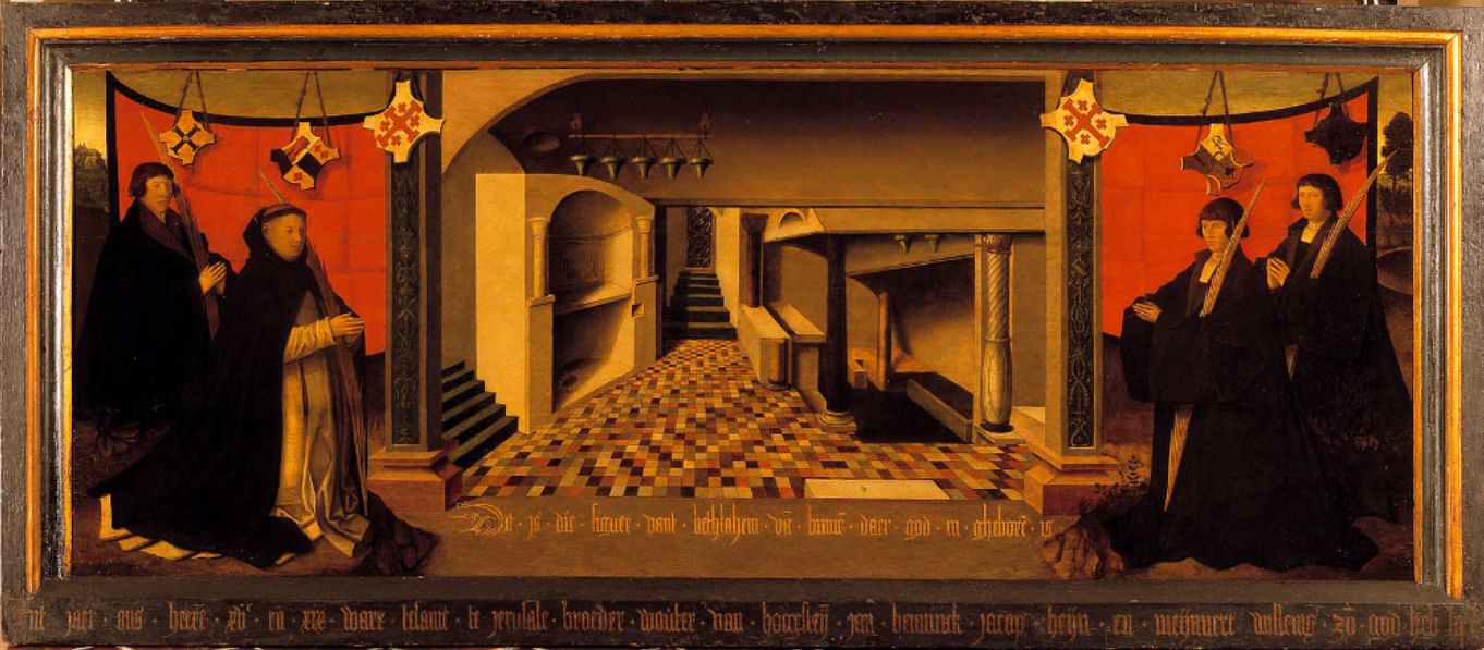
2. Amsterdam Jerusalem Pilgrims, anonymous, c. 1520, oil on panel, 99×23 cm, Catharijneconvent Utrecht

Chapel of St Olof today. Photo: BMA Amsterdam

3. Chapel of St Olof today. Photo: BMA Amsterdam

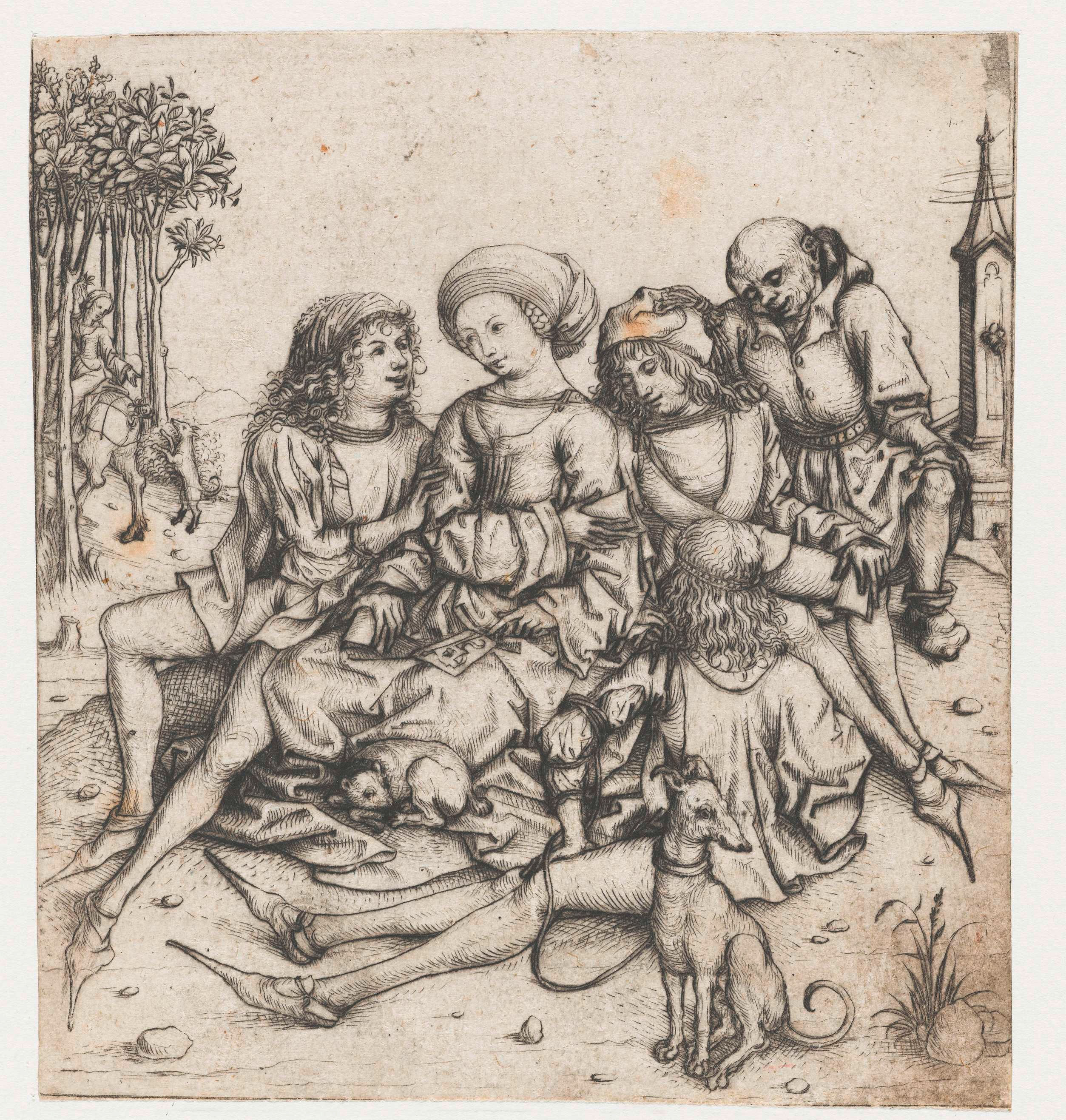
Perhaps the earliest manifestation of Dutch group portraits, that is to say: still within a religious context but no longer on (memorial) altars and consisting of groups of individuals rather than of members of a family, are portraits of Jerusalem Pilgrims. The majority of these are lost but it is known from archival sources that several were produced in Amsterdam. Not all members made the pilgrimage to the Holy Land: to become a member it sufficed to have the intention to go there. A rare survival is the portrait of four Amsterdam Jerusalem pilgrims showing them kneeling in much in the same way as families were depicted on traditional memorial altars, but here they are shown in the crypt of the Church of the Nativity in Bethlehem, a long way from home (fig. 2). Jerusalem pilgrims, mostly non-clergy belonged to a confraternity consisting of wealthy men and women. They had their own dedicated chapel: Saint Olof’s next to the medieval Saint Olof city gate (fig. 3).

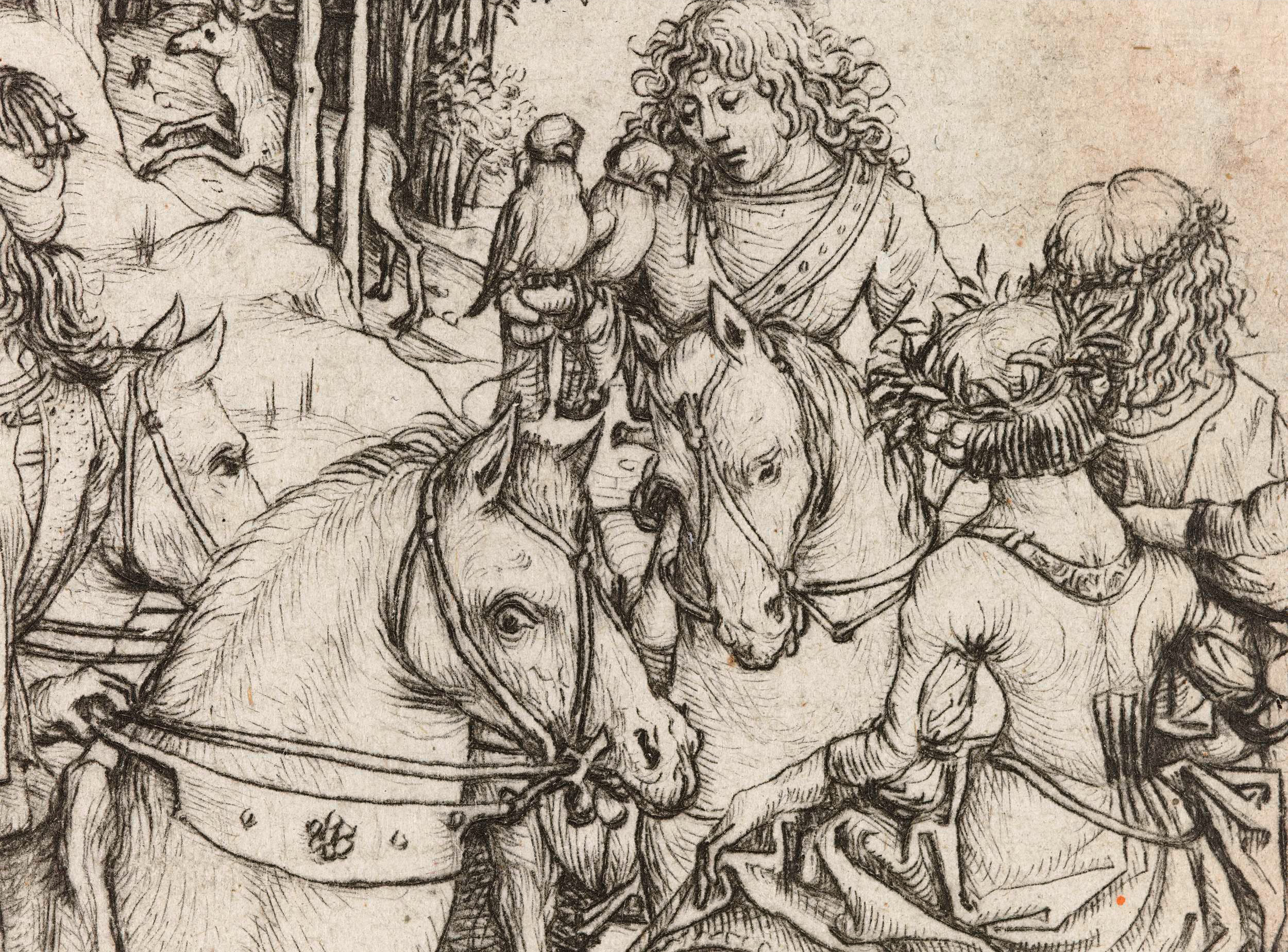
Jerusalem Pilgrims portraits seem to be a strong personal influence in the development of certain artists such as Jan van Scorel (1495-1562) (fig. 4) who, as we have seen, was a pupil of Amsterdam painter Jacob Cornelisz van Oostsanen. It is tempting to think that Jacob’s son Dirck Jacobsz (1487-1567), painter of the earliest surviving civic guards portrait (1529) was familiar with his work. As suggested in my second post on Van Oostsanen, it is not inconceivable that Van Scorel, upon his return from Italy, spent some time in Amsterdam visiting his former Master’s studio.

Jan van Scorel, Twelve Jerusalem Pilgrims, c. 1525, 61.7x 288.1 cm, Centraal Museum, Utrecht. Van Scorel has depicted himself as the fifth figure from the right

4. Jan van Scorel, Twelve Jerusalem Pilgrims, c. 1525, 61.7x 288.1 cm, Centraal Museum, Utrecht. Van Scorel has depicted himself as the fifth figure from the right

Dirck Jacobs’ portraits certainly betray manneristic influences such as we see in Van Scorel’s paintings after his return from Italy in 1518. Van Scorel may have been the first artist to dispense with a religious spiritual setting and to portray his sitters in a static row. The palm branch each pilgrim carries symbolises both their participation in the pilgrimage and their role in the annual Palm Procession where their task was to accompany a “Palm Donkey”, a life-size sculpture of Christ on a donkey, the symbol of Christ’s entry into Jerusalem. Apart from their religious and charitable duties, the confraternity also gathered socially, for instance during annual festive meals. In this, it did not differ from the civic guards guilds. Both had communal duties, both enjoyed privileges in return. Another similarity was that civic guard membership, given the expensive equipment members were expected to acquire at their own costs, was restricted to the more affluent citizens. And of course, if you wanted to be included in a group portrait, you had to be able to afford to pay your share. Both the Jerusalem Pilgrims and the civic guards did differ from other guilds in an important respect: in a traditional guild people practising the same craft united whereas the Jerusalem Pilgrims and civic guards members practised different professions.

Seventeen civic guards of Division (Rot) A of the Kloveniers, 1531 attributed to Cornelis Anthonisz (?), oil on panel, 115x195 cm, Amsterdam Museum

5. Seventeen civic guards of Division (Rot) A of the Kloveniers, 1531
attributed to Cornelis Anthonisz (?), oil on panel, 115×195 cm, Amsterdam Museum

An early Amsterdam civic guards group portrait, today tentatively ascribed to Dirck Jacobsz nephew Cornelis Anthonisz (1500-1561) shows a composition very similar to Van Scorel’s Jerusalem Pilgrims (fig. 5). In addition, apart from the seventeen civic guards being clad in full harnass, the imaginary Italianate landscape is reminiscent of Van Scorel’s work. Given Van Scorel’s demonstrable influence on his portraits, I am inclined to suggest Dirck Jacobsz or an anonymous collaborator as its possible author. The inscriptions on the labels quoting the philosopher Seneca in Latin and Dutch emphasise the Christian moral duty of the civic guards: “We are bonded by this solemn oath to bear worldly matters patiently and to not let us be affected by matters we do not have the power to avoid. Seneca”. The Latin word Sacramentum refers to the Miracle of Amsterdam and at the top right the host (the sacrament) is being shown by angels. In spite of the first signs of the Reformation having reached Amsterdam, this is still very much a catholic painting.

Law, order and privileges

In the Middle Ages, guarding Amsterdam’s city wall and gates was very much a communal affair. In addition to a small number of paid gatekeepers, nightwatchmen and the schout (sheriff) and his men, each “honest” citizen (that is to say: men who had something to lose should the city be under threat) was required to serve the communitas: they had to contribute to day and night watches and civic militia expeditions, to maintain order, extinguish fires and such. These tasks were clearly defined and strictly controlled in regulations issued by the city’s magistrates.

The oldest surviving civic guards portrait is the center panel depicting 17 civic guards of the Kloveniers, by Dirck Jacobz, 1529. The "wings" depicting 7 figures each, were added later, 1529 and or 1532-35, oil on panel, signed ANO DNI 1529 DMI, Rijksmuseum

6. The oldest surviving civic guards portrait is the center panel depicting 17 civic guards of the Kloveniers, by Dirck Jacobz, 1529. The “wings” depicting 7 figures each, were added 1532-35, oil on panel,
signed ANO DNI 1529 DMI, Rijksmuseum

Crossbow of Saint George's guild, 1580-99, wood, iron, ivory, rope, Amsterdam Museum

7. Crossbow of Saint George’s guild, 1580-99, wood, iron, ivory, rope, Amsterdam Museum

In addition, Amsterdam had some six hundred schutters (shooters) organised in three guilds. The oldest, that of the archers of Saint George, was probably founded in the mid 14th century. In a document of 1471 two other guilds are mentioned, the “young archers” of Saint George (meaning simply founded later than the older guild of the same name) and the crossbowmen of Saint Sebastian (fig. 7). The old Saint George guild ran into financial difficulties and was disbanded in 1516; in 1520 it re-emerged as the Kloveniers, immortalised, among others, in Rembrandt’s Nightwatch over a century later. They were named after the klover (arquebus), the firearm that replaced the old-fashioned longbow. The klover was also, after some resistance, adopted by the other guilds although they kept their traditional names of archers (handboog) and crossbow (voetboog) guild. Each company was initially divided into twelve rotten (divisions) of seventeen men each.

The civic guards guilds had their own headquarters (doelen) with well appointed shooting ranges. These can clearly be identified on Cornelis Anthonisz’ bird’s eye view map of 1544 (figs. 8 and 9). In addition to their militia duties, the men also had specific privileges such as annual shooting contests held in May, participating in parades and processions (for instance on the occasion of an important foreign visit such as that of the Emperor Charles V in 1515), copious banquets enlivened by music and plays (fig. 10) (described by their detractors as “gorging, boozing and reveling”), and holding religious services in beautifully appointed guild chapels in one of the city’s churches.

The annual shooting contests were called papegaaischieten. The men could demonstrate their prowess with firearms, longbow and crossbow by shooting a wooden bird (the “parrot”) from a tall pole and the winners were crowned “king” of a respective guild for one year. Winners were entitled to wear the costly guild chain and to carry the guild’s scepter. The exquisitely crafted guild chains of the mid-16th century preserved in the Amsterdam Museum testify to the wealth of these guilds (figs. 11 and 12).

Bartholomeus van der Helst, Banquet at the Crossbowmen’s Guild, 1648, detail, Rijksmuseum

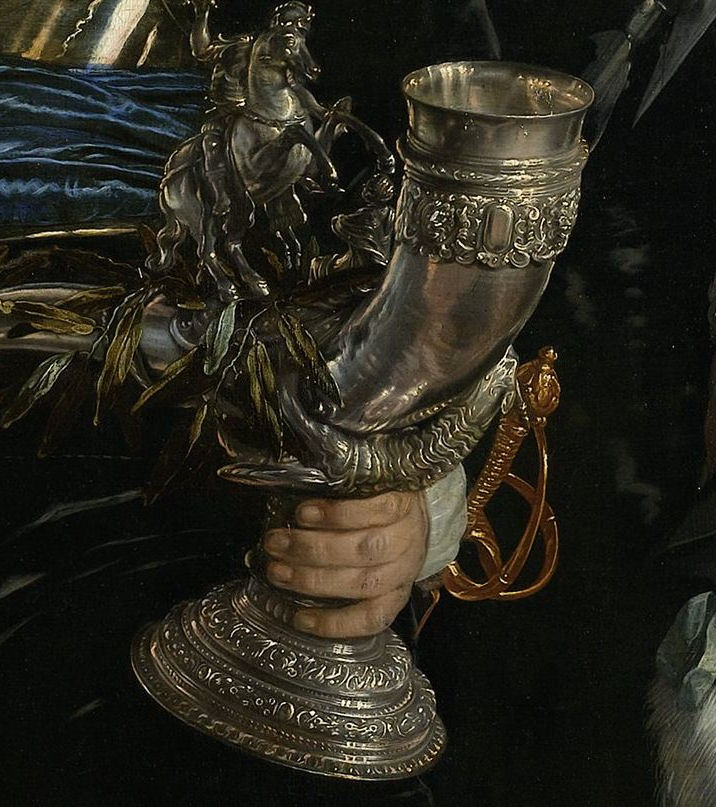
15. Bartholomeus van der Helst, Banquet at the Crossbowmen’s Guild, 1648, detail, Rijksmuseum

Elaborately decorated drinking horns (figs. 13 and 14) commissioned around the same time as the chains were obviously a symbol of pride for the civic guards companies as they feature in several 17th century guards portraits (for example see fig. 15). They continued to have a ceremonial function: important agreements were symbolically concluded by the governors of a civic guard company drinking wine from the beautifully crafted guild drinking horn. Sometimes a winner of the parrot shooting contest got extremely lucky: a painting of a “prize ox” adorned with laurels, dated 1564 (fig. 17), describes on the frame and on the painting how one Jacob Reyersz Boon won the parrot shooting contest in two consecutive years, so that apart from becoming “guild king” he was also awarded the additional prize of a magnificent ox, 1.5 meters tall and measuring three meters in circumference. Amsterdam was not yet as urbanised as it would become in later years and the cattle market was still held in the Kalverstraat close to Dam Square. An ox therefore does not seem such a strange prize at the time.

A curious group portrait dated 1534 shows eighteen civic guards including two “kings” in a prominent position, identifiable by the guild chains they wear (each guild only had one so the painter simply copied it) and the scepter they are holding (fig. 16). The second “king” is presumably a civic guard of the same division who won the shooting contest the year before and who, in 1534, was no longer a member of the division which explains why eighteen and not the customary seventeen guards are depicted. Between the two “kings” stands a rifleman loading his klover; apparently they are men of the Kloveniers guild. The landscape is a fantasy landscape with castles, just as in the group portrait attributed to Cornelis Anthonisz above (fig. 5). The panel is heavily overpainted and attribution is therefore difficult: the “king” on the left, for instance, is entirely the work of an early restorer.

Power

Were armed civic guards, consisting essentially of armed, well-to-do citizens, necessary? Certainly Amsterdam faced threats from the outside. In the Middle Ages the Bishops of Utrecht, for example, sought dominance over the city and a military siege was a realistic threat. Not for nothing was the city wall gate facing in the direction of Utrecht ominously called Swych Utrecht (literally: “be silent, Utrecht”; presumably from the word “zwicht” which means “surrender”). As long as the danger came from the other side of the robust city walls, the city was fairly well protected by its well organised and committed community.

Caricature of a parrot shooting contest: civic guards against the clergy, 1566, Rijksmuseum

18. Anonymous caricature of a parrot shooting contest: civic guards against the clergy, 1566, Rijksmuseum

But as soon as the city’s peace was threatened from within, the city’s civic militias proved less adequate. Two causes can be named in this respect: the rapid growth of the population, bringing with it over-population with its resulting rise in criminality and, a greater threat, the problem posed by the Reformation which essentially came to divide the city in the 16th century (fig. 18). It is not surprising that the series of civic guards group portraits, steadily added to from 1529 onwards, was interrupted during times of civic unrest: the Anabaptist rebellion of 1535 resulting in the change of the city’s government in 1538, the Iconoclasm of 1566 (during which the civic guards chose the side of the rampaging Calvinists) and the “civil war” of 1617-1619. In 1578 the civic militias played a decisive role in the city’s ultimate adoption of Protestantism, the Alteration, and it was they who physically ousted the catholic magistrates from the city. Important as they were in keeping the peace within the city walls, being armed and organised they also posed an inherent danger to that very peace and order. To keep this danger at bay, the city magistrates saw to it that the guards’ captains and governors were appointed from within their intimate circles.

Competition and new artistic impulse

When the old Saint George’s guild was disbanded, its headquarters were sold to pay off the guild’s debts and when, in 1520, they re-formed as the Kloveniers guild, the city placed the medieval city wall tower Swych Utrecht at their disposal to use as headquarters (fig. 19). Once the oldest, now the youngest and lowest ranking of the civic militia companies, the cramped premises of Swijgh Utrecht contrasted sharply with the magnificent headquarters of the Voetboog and Handboog civic guards on the Singel; particularly the latter could boast of a splendid building rising high above its surroundings (fig. 20).

It is possible that envy caused artistic rivalry: once the Kloveniers had initiated the first group portraits, the other civic guards companies could not stay behind. Art historically this coincided with the secularisation of the painted portrait in Amsterdam, something that had already occurred in Flanders and Italy. For Amsterdam painters, who were faced with the demise of the Catholic Church as their main source of income, this must have come as a godsend. Given the civic guards portraits from the 16th and 17th century that have survived and even taking into account that several have not, the sheer number is staggering and the many commissions must have kept painters extremely busy. It helped that some such as Dirck Cornelisz were civic guard guild members: they no doubt acquired commissions that way.

Dirck Barendsz, civic guards of division G of the Voetboogdoelen, 1562, oil on panel, 142x182 cm, dated top left: Anno a Christo nato 1562, inscription on the note: In Vino Veritas

21. Dirck Barendsz, civic guards of division G of the Voetboog guild, 1562, oil on panel, 142×182 cm, dated top left: Anno a Christo nato 1562, inscription on the note: In Vino Veritas, Amsterdam Museum

A new artistic impulse was given upon the return from Italy of the painter Dirck Barendsz (1534-1592) who, according to Karel van Mander’s Schilder-boeck (1604), had been “nursed at the great Titian’s bosom”. Titian, of course, never painted group portraits. But whereas the earliest group portraits are stiff and formal, with men grouped mostly in one or two rows and that so rigidly that Houbraken (in 1718) remarked that one could “chop off their heads with one single blow” (see for instance fig. 6), and any variety was only achieved in hand gestures or objects men are holding, Barendsz, in his Civic Guards of Division G (1562) (fig. 21), although largely sticking to compositional conventions, nevertheless achieved a freer arrangement, particularly in his far more accomplished treatment of individual facial features. The inscription In Vino Veritas (in wine there is truth) on the note on the table indicates that by the mid-16th century the civic guard companies, apart from their civic duties, enjoyed a rich social life.

Cornelis Anthonis, the "Braspenning meal" (meal of a division of the Voetboog guild), signed and ated 1533, oil on panel, 130x206.5 cm, Amsterdam Museum

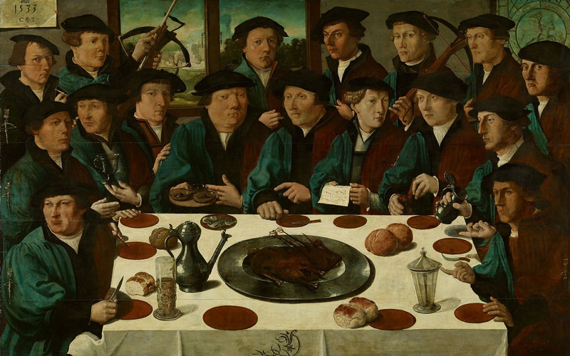
22. Cornelis Anthonisz, the “Braspenning meal” (meal of Division D of the Voetboog Guild), signed and dated 1533, oil on panel, 130×206.5 cm, Amsterdam Museum

With his broad technique Barendsz accomplished a plasticity that released the Amsterdam portrait from the rather rigid poses of earlier portraits. Following the innovative composition of Cornelis Anthonisz in his Braspenningmaaltijd of 1531 (fig. 22) (so nicknamed because of the guards’ rather frugal meal: a braspenning coin was worth not much more than five cents), where the sitters are arranged around a dinner table, Barendsz, in his Poseters (Ruffe Eaters, named after the fish they are served) of 1566, took this a step further and achieved a relative liveliness that was new in Amsterdam group portraiture (fig. 23). The merits of Cornelis Anthonisz’ painting, who was himself a member of the Voetboog civic guards, pays great attention to the details on the table and the harmonisation of the colour scheme. The beautiful calligraphy of the letter D was a hallmark of the Van Oostsanen workshop (see previous posts). Quite possibly the man portrayed top left holding a lead pencil in his hand, seated right below the date and signature, is a self-portrait of Cornelis Anthonisz, who was thirty-three years old at the time.

Dirck Barendsz, meal of 18 civic guards of the Kloveniers division F (the "poseters") 1566, oil on panel, 120×295, Rijksmuseum

23. Dirck Barendsz, meal of 18 civic guards of the Kloveniers division F (the “Poseters”) 1566, oil on panel, 120×295, Rijksmuseum

Fashion trends

Detail from Frans Hals and Pieter Codde, 1637, Amsterdam

24. Detail from Frans Hals and Pieter Codde, 1637, Amsterdam

What immediately strikes one in 17th century civic guards portraits, such Frans Hals and Pieter Codde’s Militia Company of District XI of 1637 (fig. 24), are the sumptuous colourful costumes, the laces and silks the men are wearing. How different, as we have seen in the examples above, were things during the 16th century. Under the influence of Remonstrantism and humanism but also that of the Spanish court of the Southern Netherlands, both of which prescribed restrained clothing, the men generally wear sober attire consisting of a dark tabard with a doublet underneath. Indeed, observing the earliest group portraits, we see that, for instance in Cornelis Anthonisz’ Braspenning Meal (1533) (fig. 22) all men were the exact same attire, a 16th century custom denoting a group’s social status or class. Fashion followed strict guidelines: decrees and/or social codes dictated who could wear satin, silk brocade, fur or fine and rough linen.

An exception to this is the jerkin with vertical splits originally worn by common soldiers, which was essentially a cheap version of the cuirass. It is rather unusual that both the court and citizens followed common soldiers’ fashion. At the Habsburg court the common soldiers’ jerkin was even regarded as an act of defiance (or caricature). Nevertheless, or perhaps even because of this, the jerkin with slits came to be worn by the nobility (fig. 25). Prosperous inhabitants of the cities adopted it too and so, perhaps, defied the strict division of the classes.

29. Detail of fig.

29. Detail of fig. 23

In 1978 a leather jerkin was discovered during dredging works on Amsterdam’s Oudezijds Achterburgwal (fig. 26). It can be dated circa 1550 and may have belonged to a member of a civic guard company. In certain early civic guards portraits one of the men wears a controversial leather jerkin with vertical slits, such as in the Seventeen civic guards of Division F of the Kloveniers where the central figure wears such a jerkin (fig. 27). In Dirck Barendsz Civic Guards of Division G, one of the figures sitting left of the table wears also wears the jerkin (fig. 29) as does the central figure in a 1556 civic guards group portrait.

Evidently the choice for such a relatively inexpensive piece of clothing held special meaning for civic guards companies. After all, in spite of their considerable privileges, the men were essentially functioning as the city’s main defence in times of trouble; they were the city’s unpaid soldiers as it were. But perhaps a little defiance on the part of the increasingly emancipated citizens of Amsterdam towards those in power also played a role.

In a further conscious or subconscious imitation of the court and nobility, civic guard guilds, who also sported “kings”, employed a fool or tuymelaer (tumbler), a fact that is not generally known. In one unique case, a civic guards painting of the Crossbowmen’s or Voetboog Guild of 1554, a fool is shown (top right), identified by the owl on his shoulder (fig 30). With a small crossbow insignia ironically topped by a crown in his hand, he grins at us conspiratorially. Included too is a hooded falcon, symbolising that ultimate sport of the nobility: the falcon hunt. Of all the civic guards portraits of the 16th century, this is the only painting where some of the men portrayed are actually showing an inkling of a smile on their lips and a twinkle in their eye.

Civic Guards of Division E of the Crossbow (Voetboog) Guild, 1554, attr. to the Master of the Antwerp Family Portrait, oil on panel, 163.5x206.5 cm, Amsterdam Museum

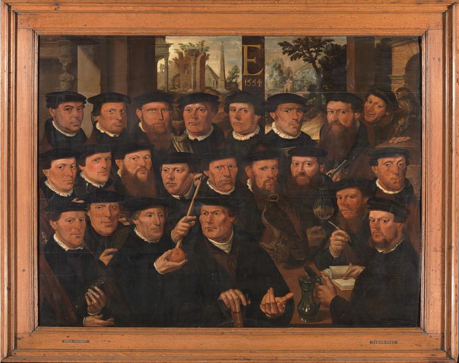
30. Civic Guards of Division E of the Crossbow (Voetboog) Guild, 1554, attr. to the Master of the Antwerp Family Portrait, oil on panel, 163.5×206.5 cm, Amsterdam Museum

Notes:

  1. The exhibition “In All Their Glory” at Amsterdam’s Royal Palace runs until 31 August 2014. There  no catalogue, but there is an informative website in English here.
  2. For more on the Royal Palace, also see my posts on The Fate of Rembrandt’s Claudius Civilis, Parts 1 and 2.
  3. Ownership of the 16th and 17th century group portraits commissioned by Amsterdam’s civic guards gradually reverted to the City of Amsterdam from the third quarter of the 17th century onwards. The majority is still owned by the City and are on permanent loan to the Amsterdam Museum and the Rijksmuseum. It is unique that, with only a few exceptions, these paintings are still located in their city of origine.
  4. For selected sources, see the next instalment here.

Zest for life: The Master of the Amsterdam Cabinet (2) – the prints

Apart from a few woodcuts ascribed to him (although far from unanimously) the surviving prints by the 15th century Master of the Amsterdam Cabinet are executed in drypoint. They are tentatively dated between 1470 and 1490. The 91 prints known today, of which 78 are listed as unique impressions, formed part of the collection of Pieter Cornelis, Baron van Leyden (1717-1788). Nothing is known about their provenance prior to the 18th century. Today, 82 prints are held by the Rijksmuseum which is why, in spite of the likely German origins of the Master, he is also known as the Master of the Amsterdam Cabinet.

Drypoint technique – advantages and limitations

1. Blades of grass, detail from “Fighting Peasants”, Rijksmuseum

The Master in all probability used a soft metal plate such as tin which allows the burin to be more easily and sketchily pushed through the plate’s surface. The burin digs a furrow in the plate turning up curls of metal on either side of the engraved furrow. These curls, known as the burr, hold a quantity of ink and create a rich velvety or blurred effect when printed (fig 1). The burr wears away after only a few impressions which could be the reason why so few of the Master’s prints have survived and so many of those exist as unique impressions.

Early prints

The Master’s early prints are characterised by their small size. Lines are rather hesitantly drawn and the images show simple compositions that are mostly restricted to one or two figures. The prints are nevertheless surprisingly original as shown in three small prints depicting children at play, two of which are illustrated below (figs 2 and 3).

With great tenderness and humour the Master depicts the toddlers as they discover the world around them. Standing on your head, trying to get up while holding a toy, crossing your legs; the first experiences of a small child. They may have served as models for marginalia in illuminated manuscripts which seems to be corroborated by their small size. An example would be a delightful depiction in the Hours of Catherine of Cleves of the Christ Child and St John playing together as children (fig 4).

4. Book of Hours of Catherine of Cleves, ca. 1440, Pierpont Morgan Library

Stylistic developments

The Master’s style evolved from its hesitant beginnings into a style showing a larger format and more careful hatchings. One of his most surprising and original prints is that of a young hunting dog scratching himself (fig 5). Again, the only parallel would be marginalia where such free and playful images are often found, although the print’s relatively large format indicates that the image probably did not serve as a model for a miniaturist. It is a strikingly realistic portrayal: the dog is so well observed, his fur and his pose so convincingly rendered that there can be little doubt that the Master depicted him from life. Only years later, when Albrecht Dürer began to draw animals, do we find such detailed and natural depictions.

5. Unique impression (ca. 1475), 11.3 x 11.2 cm, Rijksmuseum.

Saint Martin on horseback (fig 6) can also be placed within the artist’s middle period. Certain similarities in clothing and in the way the cross-hatchings have been executed indicate that the Master could have been familiar with Martin Schongauer’s slightly earlier version (fig 7). In Schongauer’s print the saint shares his mantle with a beggar who functions as an attribute of the Saint rather than as a participant in the drama. The Master is more successful in integrating the beggar into the story and in establishing an emotional relationship between him and the Saint.

The “court period”

Gradually, we see a development towards a stronger spatial suggestion, more refinement and a more confident execution as well as more complex compositions. The Master reached his artistic peak in prints where he worked with a very fine hard-pointed needle, especially in his renderings of courtly life. As we have seen in the previous post, the court of Frederick III in the German Middle-Rhine region is thought to have been the environment where the Master may have worked, at least for some time. An intriguing print is The Card Players (fig 8).

8. The Card Players (ca. 1485), 13 x 12 cm, Rijksmuseum

A pretty young woman is surrounded by three young men dressed in the latest court fashion. She has just played her trump card. The expressions on the young men’s faces show how much she has beguiled them. Images of (prospective) lovers playing games are not unusual in this period and are usually placed in a garden of love setting. The Master gives an original twist to the theme by predicting the outcome of the game: we see a love couple disappearing into the forest on horseback. But who will she choose? She allows one of the young men to see her remaining cards, but the fool is looking over his shoulder – has he been dealt the Fool? Observe also the two dogs, symbols of fidelity: one sits upright and is alert, the other lies fast asleep at the woman’s feet. It seems this card game could go either way.

A comparison of two hunting scenes shows how the master’s style further developed. The first is still related to the court environment. In Departure for the Hunt (fig 9) a fashionably dressed aristocratic group of men and women are preparing to go on a hunting party.

9. Detail: Departure for the hunt (ca. 1485-90), 12.5 x 9.2 cm, Rijksmuseum

Judging by the wreaths around their heads two participants are engaged. The hunt was traditionally associated with courtly love and in contemporary literature serves as a metaphor for a lover conquering his beloved. Fidelity and perseverance play an important role.

Several years later, another hunting scene print by the Master seems removed from courtly ideals. The deer hunt (fig 11) is one of the earliest and most surprising depictions of outdoor life, chronologically preceded by marginalia such as a hunting scene in the Book of Hours of Catherine of Cleves (fig 10).

10. Hunting scene, Hours of Catherine of Cleves, ca. 1440, Pierpont Morgan Library

11 The Deer Hunt (ca. 1485-90), 9.3 x 8.3 cm, Rijksmuseum

In the Master’s print, light and dark contrasts play an important part in suggesting space and distance. Blowing the horn signals the start of the hunt, the dogs are running after deer fleeing into the forest and a rabbit runs away on the right, a humourous touch. While the aristocratic group in Departure for the Hunt is more interested in each other than in the hunt, here a realistic hunt is depicted. Elements such as the dead tree with the crow’s nest, the grave along the roadside and the lonely traveller seen in the background are possibly meant as reminders of death, man’s constant companion in life: a memento mori.

The Master’s sense of humour and originality is evident in various prints showing heraldic shields (fig 12). Their precise meaning is unclear. In the 15th century social positions were shifting and heraldic shields were no longer the exclusive privilege of the nobility: rich citizens could consolidate their status by means of a family weapon. But instead of angels or lions we are presented with farmers and gipsies as supporters. The irony with which some figures are depicted points to the prints possibly being intended as satires on the aristocratic pretences of common citizens.

12. Heraldic shield with farmers (ca. 1485-90), 13.7 x 8.4 cm, Rijksmuseum

A farmer standing on his head is seen from behind. He leans his hands on two pieces of rock. The shield’s helmet is crowned by a farmer who is literally crushed by the weight of his wife sitting on his back. Although he screams in protest it doesn’t help him and she has found a way to make him assist her as she spins her yarn. The meaning is clear: just as the man standing on his head gets a distorted view of the world, the farmer and his wife represent the normal social order turned upside down.

Late period

A new element is the greater freedom with which the late prints are executed. Lines become more nervous and energetic. The two versions of Saint Christopher, the first executed in his riper style and the later version interpreted with greater artistic freedom, are our final examples.

The story of Saint Christopher is told in the 13th century Legenda Aurea (Golden Legend). He is a giant who carries travellers across a turbulent river. One night a child asks to be carried across. Lit by a hermit’s lantern they reach the other side of the river but with great difficulty because the child is none other than Christ, who “carries all the burdens of the world” and becomes heavier with every step. Only the next day does Christopher realise the true identity of his passenger when his staff, planted in the earth at the request of the child, sprouts into a date palm. In a 14th century German manuscript green leaves already sprout from the staff while Christopher and the child are crossing the river as shown in the Master’s print.

15. Israhel van Meckenem, copy in reverse, engraving, 16.2 x 10.5 cm, British Museum

The first version by the Master, called the “large version” (fig 13), is possibly loosely based on an earlier print by Schongauer (fig 14), but more convincing in that the weight of the child is more effectively distributed over the staff and the giant’s legs. How difficult it is for Christopher to keep his balance is illustrated by a wonderful detail: the Saint has wrapped his hand in his mantle to secure his grip on his staff. The print was apparently popular as can be seen from a slighty later copy by Israhel van Meckenem (fig 15).

The irises, symbols of Christ’s suffering, seen in the foreground in Schongauer’s print, only appear in the second version by the Master which is tentatively dated ca. 1490 and executed in his late style (fig 16). The world’s burdens carried by the Christ Child are symbolised by the globe he carries, the church points to Christopher’s servitude to Christ and the giant himself is dressed as a pilgrim. The regular hatchings influenced by Schongauer seen in the earlier version here make way for a lively, more dynamic treatment of light and shadow. The water, while imaginatively indicative of movement in the earlier print, in the second print is verging on the abstract.

16. St Christopher “small version”, unique impression (ca. 1490), 12.3 x 7.2 cm

A Master without an identity

Several of the Master’s prints were copied by contemporary artists and some are thought to have influenced the young Dürer, yet his name has not come down to us. An explanation could lie in his association with the nobility which appears so clearly from the self-assured way in which the Master depicts their interests and ideals. He must have worked closely with one or several aristocratic patrons and for his altarpieces with the highest church authorities. As their protégé the artist enjoyed a secure position and livelihood – a luxury Dürer never knew – and it was therefore unnecessary for his name to be known outside these circles. But this means, alas, that the Master’s name was lost forever when his last patron died.

Notes:

  1. All prints shown in this post are by the Master of the Amsterdam Cabinet unless stated otherwise.
  2. The most helpful study for the chronological and stylistic grouping of the prints remains the article by Curt Glaser, “Zur Zeitbestimmung der Stiche des Hausbuchmeisters”, in Monatshefte für Kunstwissenschaft 3 (1910).
  3. I am indebted to the catalogue of the 1985 exhibition in the Rijksmuseum’s Prints and Drawings Gallery: ‘s Leven’s Felheid: de Meester van het Amsterdamse Kabinet of de Hausbuch-meester, ca. 1470-1500, K.G. Boon et al, published by Uitgeverij Gary Schwartz, Maarssen for the Rijksmuseum, 1985.

The other Venice

Picturesfromitaly_titlepageCharles Dickens’ account of his trip to Italy in 1846 is quite unlike those of other literati such as Goethe. In Pictures from Italy (1846) you will not find meticulous and lyrical descriptions of the wonders of Italy’s art but rather, like a child on holiday, Dickens indulges in the sheer delight of being abroad, of waking up in an Italian bed. The book, as its title suggests, is very much a photo album filled with Italian people and their customs and, so characteristic of Dickens, his indignation at what he perceives as social injustice (which he blames on the roman catholic church).

But the tone changes when he reaches Venice. While other chapters have prosaic topographic titles, the chapter devoted to Venice is simply entitled An Italian Dream and throughout it Dickens maintains the dream metaphor. Yet even in this dream of a city where “golden crosses glittered in the light, atop of wondrous churches”, he could not escape from the city’s desperate plight:

“… for the greatness of the city was no more […]. Indeed, it seemed a very wreck found drifting on the sea; a strange flag hoisted in its honourable stations, and strangers standing at its helm.”

With this description, Dickens strikes at the core of what Venice is today, as a result of events that occurred during the early years of the 19th century: the brief Napoleonic rule following the fall of the Republic in 1797 and three subsequent periods of Austrian rule lasting until 1866. Events that deprived the city of the political and economic role it had exercised for hundreds of years and moreover of its identity, reducing it to a monument of the past, robbed of its organic existence. This, in Giandomenico Romanelli’s words, established “a climate of apathy and weariness, of general demoralisation in the way lives were conducted in a city that had outlived itself.” That this had a lasting impact on Venice’s unique architecture may be self-evident.

Francesco Albotto (1721-1757), The Canal Grande with the Fondaco dei Turchi (sold Sotheby's 2005, presents whereabouts unknown)

Francesco Albotto (1721-1757), The Canal Grande with the Fondaco dei Turchi (right)  (sold at Sotheby’s in 2005, presents whereabouts unknown)

Ruskin Turchi

Ruskin, watercolour of the Fondaco dei Turchi

The Fondaco dei Turchi (Turkish warehouse) was not built as such but as a family palace of the old-fashioned Veneto-Byzantine sort in the first half of the 13th century by Giacomo Palmier, an exile from Pesaro. From the early 17th century through to 1838, the Fondaco served as a combination of home, warehouse and market for Turkish traders. As shown by Francesco Albotto (above) it had just been altered in 1751 but it was already in poor state of repair. The building was sold in 1838 to the builder Petich who made it his office, yard and warehouse. He tried several times to obtain permission to demolish the building and rebuild it on the site, but in the 1860s, when it had become, in Ruskin’s words “a ghastly ruin”, plans were finally initiated to restore what was left of it. By that time, Petich had sold the building to the Commune: the plan that was eventually carried out was designed by the engineers Federico Berchet and Agostino Sagredo.

"A ghastly ruin". The Fondaco dei Turchi photographed c. 1860

“A ghastly ruin (…) blanched into dusty decay by the frost of centuries”. The Fondaco dei Turchi photographed c. 1860

Bechet and Agostino Sagredo's project for the restoration of the Fondaco, 1860

Berchet and Sagredo’s restoration of the Fondaco dei Turchi, 1860s

One of the problems with 19th century restoration in general – and glaringly obvious today – is that imaginative interpretations of still existing historical elements were forced onto structures without fully understanding them. For the Fondaco dei Turchi this resulted in two towers being added on either end against any historical evidence that these were ever there. In addition, “Turkish” crenellations were supplied, inspired, incredibly, by the triangular crenellations on the mosque of Ahma Ibn Tulin in Cairo. The cladding of the building, though still incorporating a few original elements, was largely provided from the Greek marble left over from the restoration of the north façade of San Marco while the decorative reliefs and cornices were retrieved from the attics of half the city. After lengthy discussions whether or not to polish the marble cladding, Berchet cleaned it severely with a lead-plate polisher. The result looks rather, to stay with Dickens, like Miss Havisham’s wedding cake.

The Fondaco dei Turchi today

The Fondaco dei Turchi today houses Venice’s Natural History Museum

Venice had its Fondaco dei Turchi back but at the cost of the building’s integrity and history. Formerly a “ghastly ruin”, today it might be called a “ghastly failure” and it is ironic that the building is still described as twelfth or thirteenth century. In 1985 Manfredo Tafuri wrote:

“[it] was the worst possible betrayal of Venetian “continuity”: in the face of an evident crisis in that continuity, “hypervenetianism” was invented. There is one name that summarises all this: Berchet.”

To do justice to Berchet, he did conduct detailed historical research, only with so little left of the building he superimposed his own imprint on it with a total disregard for the material reality of what was there. Anyone looking at the ruins of the Fondaco and comparing it with historic prints can see that the medieval Veneto-Byzantine building it once was was lost forever. This is easily said with hindsight and in those early years restoration as we know it today had not been born yet – in Venice the term was “archeological engineering” – and it was John Ruskin’s great merit to be the first to insist on the distinction between conservation and restoration. For many unique Venetian buildings, however, this distinction was not heeded.

640px-Apollonio_Domenichini_Venezianische_Vedute_mit_Fondaco_dei_Tedeschi

Canaletto, Canal Grande with the Fondaco dei Tedeschi (left) showing the two towers at either ends of the building (c. 1670)

Ironically, while the Fondaco dei Turchi acquired turrets where there had never been, the Fondaco dei Tedeschi, the German Warehouse near Rialto Bridge, lost them. The history of the Fondaco dei Tedeschi goes back to 1228 but after its destruction by fire it was completely rebuilt between 1505 and 1508, resulted in a functional four-storey building with a grand inner courtyard. The ground floor, accessible by water, was used for storage, the first floor was dedicated to offices and an upper area contained about 160 living quarters.

Fondaco dei Tedeschi; Triumph of Justice; Giorgione, Titian, Galleria Francetti, Venice.

Fondaco dei Tedeschi; Triumph of Justice; Giorgione, Titian, Galleria Francetti at Ca’ d’Oro, Venice.

In 1507 Giorgione was commissioned to decorate the façade with frescos and the young Titian either assisted him or received an independent commission. Unfortunately, the salt water wreaked havoc and the frescos started to deteriorate not long after their creation. In Canaletto’s painting above, they are only just discernible. Only a few tantalising fragments have been preserved.

Fondaco dei Tedeschi, 1853

Fondaco dei Tedeschi, 1853

In this 1853 photograph, the Fondaco dei Tedeschi has already lost its two towers (see the painting attributed to Dominichini above). As early as 1838, a Venetian report indignantly states:

“When this building was recently restored, the two external torricelle were demolished, and for them were substituted merlature along the rooftop like those already existing. What may have induced those responsible to do such a thing we have no idea. (…) Their action had two other unfortunate consequences: first, that the two historic inscriptions between the windows of the towers (…) disappeared; secondly, that the two figures by Giorgione were destroyed, and they were perhaps the best preserved among those that survived.” (Le fabbriche e i monumenti più cospicui di Venezia, 1838).

The Fondaco dei Tedeschi today

The Fondaco dei Tedeschi today

Today the Fondaco dei Tedeschi remains an unhappy building. It was very radically restored in the 1930s when it became the central post office. The original structure was reinforced by the insertion of an iron grid or cage of reinforced concrete, utterly destroying the basis on which the building had been constructed and irreversible. This solution to counter sagging is used even today since it is a cheap and, so it is believed, permanent remedy, but when a building is immured and can no longer organically counteract the movement of the soft soil, in the end concrete reinforcement proves detrimental for a long-term survival.

When, in the early years of the 21st century, the post office was moved to the mainland and the building was put up for sale the only interested buyers were hotel consortia and in a desperate attempt to prevent such a fate, the Commune negotiated its purchase. Failing to find a permanent destination, in 2008 the Commune sold it for GBP 45 million to clothing giant Benetton. The prestigious architectural firm OMA was engaged to convert it into a combined shopping mall and cultural center.

Plan for the inner courtyard of the Fondaco dei Tedeschi by OMA architect Rem Koolhaas, 2012.

Plan for the inner courtyard of the Fondaco dei Tedeschi by OMA, 2012.

United colors ...OMA’s plans include cutting out part of the roof to create a terrace, building two new entrances and fitting escalators inside. Heritage campaigners, among which Italia Nostra (Our Italy) protested that the alterations would cause “serious damage to the building’s physical integrity and historical identity” – but one wonders, after the many aggressive interventions that took place in the past centuries, what historical identity remains? The protests had no effect other than postponing the inevitable and in 2012 OMA was given the go-ahead to transform the Fondaco into a shopping complex and cultural center.

The question is, of course, whether Venetians, or indeed Venice, needs yet another luxury shopping area and whether Venetians are not better served with affordable infrastructure rather than a cultural center. A city dies when its citizens leave and that, alas, is currently the tragic fate of Venice.

Ca'da Mosto

Ca’da Mosto in 2005

The 20th century has seen two major restoration campaigns, one between 1902 and 1912 following the collapse of San Marco’s Campanile and one, which is still ongoing, after the floodings of 1966. One of the grand buildings along the Canal Grande to be restored in the 1902-1912 campaign was the Ca’ da Mosto, the oldest building along the canal. The uniqueness of Ca’ da Mosto lies in the fact that it managed to escape the devastating “archeological engineering” of the 19th century, perhaps because it served as a famous inn, the Leon Blanco from the 17th to the early 19th century and so had not fallen into “dusty decay” like its unfortunate contemporaries.

Ca' da Mosto, detail of Veneto-Byzantine facade

Ca’ da Mosto, detail of Veneto-Byzantine facade

Ca' da Mosto, c. 1853

Ca’ da Mosto, c. 1853

The palazzo’s origins are Veneto-Byzantine of the thirteenth or even twelfth century. It was extended in the 16th century with two further storeys. The holes of the former grilles are (or I should say: were) still visible in the lateral single windows of the first floor, each of which is crowned by a patera (an oval feature). An aperture of the central loggia was bricked up later but reopened in the early 20th century restoration. Apart from the paterae, this loggia with its seven arches has reliefs with floral motifs in the marble incrustation. Remnants of an open stairway can be seen in the public courtyard.

Detail of ceiling, Ca' da Mosto

Detail of ceiling, Ca’ da Mosto

Ca’ da Mosto has been decaying and its fate remained uncertain. With its structure becoming unsound and sagging, its lower floor is permanently submerged in the salty water (the difference in the lower floor level can clearly be seen when compering the recent images with that of 1853) that eats at its stonework. Certainly, for some it must have been a sight for sore eyes among the splendours of the spruced up palazzi along the Canal GrandeBut while the building requires conservation, it may well be asked how desirable it is that it should be pristine. Is there not something immensely appealing to its “dusty decay? And most of all: should not its historic integrity be respected rather than “rendered like a corpse in a funeral parlour to a decent state of viewing” as Gianfranco Pertot phrased it?

Ca' da Mosto, 2010, photograph author

Ca’ da Mosto, 2010, photograph author

cadamosto1

The gutted interior of the Ca’ da Mosto

Some ten years ago, Ca’ da Mosto passed into the hands of a buyer who had intended to refurbish it but was unable to obtained the necessary funds. As always, when a historic building of such importance falls into the hands of a private investor, the object is not altruism but economic viability and profit with its inherent dangers of negation of a building’s integrity. We have seen this in the case of the Fondaco dei Tedeschi, but there is so much more to lose here as the building, though practically gutted on the inside, is still so much more intact. What would be required in an ideal world is a sensitive restoration, or better: a minimally interventionist conservation to ensure this unique building continued life.

But this is not to be: apparently between 2010 when I last saw it and today funds have been raised and the restoration of the façade is well under way. On a photograph taken earlier this month it looks as if Ca’ da Mosto will, like the other grand buildings along the Canal Grande, look pristinely polished. Of course one should reserve judgement until the end result is known but the signs do not look promising.

Ca’ da Mosto’s destination is as yet uncertain: it is “for sale as a residence, hotel or gallery.” Just what Venice needs.

Ca' da Mosto, September 2013. By kind permission of John and Carol Isles

Ca’ da Mosto, September 2013. By kind permission of John and Carol Isles