Apart from a few woodcuts ascribed to him (although far from unanimously) the surviving prints by the 15th century Master of the Amsterdam Cabinet are executed in drypoint. They are tentatively dated between 1470 and 1490. The 91 prints known today, of which 78 are listed as unique impressions, formed part of the collection of Pieter Cornelis, Baron van Leyden (1717-1788). Nothing is known about their provenance prior to the 18th century. Today, 82 prints are held by the Rijksmuseum which is why, in spite of the likely German origins of the Master, he is also known as the Master of the Amsterdam Cabinet.
Drypoint technique – advantages and limitations

1. Blades of grass, detail from “Fighting Peasants”, Rijksmuseum
The Master in all probability used a soft metal plate such as tin which allows the burin to be more easily and sketchily pushed through the plate’s surface. The burin digs a furrow in the plate turning up curls of metal on either side of the engraved furrow. These curls, known as the burr, hold a quantity of ink and create a rich velvety or blurred effect when printed (fig 1). The burr wears away after only a few impressions which could be the reason why so few of the Master’s prints have survived and so many of those exist as unique impressions.
Early prints
The Master’s early prints are characterised by their small size. Lines are rather hesitantly drawn and the images show simple compositions that are mostly restricted to one or two figures. The prints are nevertheless surprisingly original as shown in three small prints depicting children at play, two of which are illustrated below (figs 2 and 3).


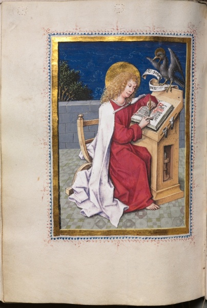
With great tenderness and humour the Master depicts the toddlers as they discover the world around them. Standing on your head, trying to get up while holding a toy, crossing your legs; the first experiences of a small child. They may have served as models for marginalia in illuminated manuscripts which seems to be corroborated by their small size. An example would be a delightful depiction in the Hours of Catherine of Cleves of the Christ Child and St John playing together as children (fig 4).

4. Book of Hours of Catherine of Cleves, ca. 1440, Pierpont Morgan Library
Stylistic developments
The Master’s style evolved from its hesitant beginnings into a style showing a larger format and more careful hatchings. One of his most surprising and original prints is that of a young hunting dog scratching himself (fig 5). Again, the only parallel would be marginalia where such free and playful images are often found, although the print’s relatively large format indicates that the image probably did not serve as a model for a miniaturist. It is a strikingly realistic portrayal: the dog is so well observed, his fur and his pose so convincingly rendered that there can be little doubt that the Master depicted him from life. Only years later, when Albrecht Dürer began to draw animals, do we find such detailed and natural depictions.

5. Unique impression (ca. 1475), 11.3 x 11.2 cm, Rijksmuseum.
Saint Martin on horseback (fig 6) can also be placed within the artist’s middle period. Certain similarities in clothing and in the way the cross-hatchings have been executed indicate that the Master could have been familiar with Martin Schongauer’s slightly earlier version (fig 7). In Schongauer’s print the saint shares his mantle with a beggar who functions as an attribute of the Saint rather than as a participant in the drama. The Master is more successful in integrating the beggar into the story and in establishing an emotional relationship between him and the Saint.


The “court period”
Gradually, we see a development towards a stronger spatial suggestion, more refinement and a more confident execution as well as more complex compositions. The Master reached his artistic peak in prints where he worked with a very fine hard-pointed needle, especially in his renderings of courtly life. As we have seen in the previous post, the court of Frederick III in the German Middle-Rhine region is thought to have been the environment where the Master may have worked, at least for some time. An intriguing print is The Card Players (fig 8).

8. The Card Players (ca. 1485), 13 x 12 cm, Rijksmuseum
A pretty young woman is surrounded by three young men dressed in the latest court fashion. She has just played her trump card. The expressions on the young men’s faces show how much she has beguiled them. Images of (prospective) lovers playing games are not unusual in this period and are usually placed in a garden of love setting. The Master gives an original twist to the theme by predicting the outcome of the game: we see a love couple disappearing into the forest on horseback. But who will she choose? She allows one of the young men to see her remaining cards, but the fool is looking over his shoulder – has he been dealt the Fool? Observe also the two dogs, symbols of fidelity: one sits upright and is alert, the other lies fast asleep at the woman’s feet. It seems this card game could go either way.
A comparison of two hunting scenes shows how the master’s style further developed. The first is still related to the court environment. In Departure for the Hunt (fig 9) a fashionably dressed aristocratic group of men and women are preparing to go on a hunting party.

9. Detail: Departure for the hunt (ca. 1485-90), 12.5 x 9.2 cm, Rijksmuseum
Judging by the wreaths around their heads two participants are engaged. The hunt was traditionally associated with courtly love and in contemporary literature serves as a metaphor for a lover conquering his beloved. Fidelity and perseverance play an important role.
Several years later, another hunting scene print by the Master seems removed from courtly ideals. The deer hunt (fig 11) is one of the earliest and most surprising depictions of outdoor life, chronologically preceded by marginalia such as a hunting scene in the Book of Hours of Catherine of Cleves (fig 10).

10. Hunting scene, Hours of Catherine of Cleves, ca. 1440, Pierpont Morgan Library

11 The Deer Hunt (ca. 1485-90), 9.3 x 8.3 cm, Rijksmuseum
In the Master’s print, light and dark contrasts play an important part in suggesting space and distance. Blowing the horn signals the start of the hunt, the dogs are running after deer fleeing into the forest and a rabbit runs away on the right, a humourous touch. While the aristocratic group in Departure for the Hunt is more interested in each other than in the hunt, here a realistic hunt is depicted. Elements such as the dead tree with the crow’s nest, the grave along the roadside and the lonely traveller seen in the background are possibly meant as reminders of death, man’s constant companion in life: a memento mori.
The Master’s sense of humour and originality is evident in various prints showing heraldic shields (fig 12). Their precise meaning is unclear. In the 15th century social positions were shifting and heraldic shields were no longer the exclusive privilege of the nobility: rich citizens could consolidate their status by means of a family weapon. But instead of angels or lions we are presented with farmers and gipsies as supporters. The irony with which some figures are depicted points to the prints possibly being intended as satires on the aristocratic pretences of common citizens.

12. Heraldic shield with farmers (ca. 1485-90), 13.7 x 8.4 cm, Rijksmuseum
A farmer standing on his head is seen from behind. He leans his hands on two pieces of rock. The shield’s helmet is crowned by a farmer who is literally crushed by the weight of his wife sitting on his back. Although he screams in protest it doesn’t help him and she has found a way to make him assist her as she spins her yarn. The meaning is clear: just as the man standing on his head gets a distorted view of the world, the farmer and his wife represent the normal social order turned upside down.
Late period
A new element is the greater freedom with which the late prints are executed. Lines become more nervous and energetic. The two versions of Saint Christopher, the first executed in his riper style and the later version interpreted with greater artistic freedom, are our final examples.
The story of Saint Christopher is told in the 13th century Legenda Aurea (Golden Legend). He is a giant who carries travellers across a turbulent river. One night a child asks to be carried across. Lit by a hermit’s lantern they reach the other side of the river but with great difficulty because the child is none other than Christ, who “carries all the burdens of the world” and becomes heavier with every step. Only the next day does Christopher realise the true identity of his passenger when his staff, planted in the earth at the request of the child, sprouts into a date palm. In a 14th century German manuscript green leaves already sprout from the staff while Christopher and the child are crossing the river as shown in the Master’s print.


15. Israhel van Meckenem, copy in reverse, engraving, 16.2 x 10.5 cm, British Museum
The first version by the Master, called the “large version” (fig 13), is possibly loosely based on an earlier print by Schongauer (fig 14), but more convincing in that the weight of the child is more effectively distributed over the staff and the giant’s legs. How difficult it is for Christopher to keep his balance is illustrated by a wonderful detail: the Saint has wrapped his hand in his mantle to secure his grip on his staff. The print was apparently popular as can be seen from a slighty later copy by Israhel van Meckenem (fig 15).
The irises, symbols of Christ’s suffering, seen in the foreground in Schongauer’s print, only appear in the second version by the Master which is tentatively dated ca. 1490 and executed in his late style (fig 16). The world’s burdens carried by the Christ Child are symbolised by the globe he carries, the church points to Christopher’s servitude to Christ and the giant himself is dressed as a pilgrim. The regular hatchings influenced by Schongauer seen in the earlier version here make way for a lively, more dynamic treatment of light and shadow. The water, while imaginatively indicative of movement in the earlier print, in the second print is verging on the abstract.

16. St Christopher “small version”, unique impression (ca. 1490), 12.3 x 7.2 cm
A Master without an identity
Several of the Master’s prints were copied by contemporary artists and some are thought to have influenced the young Dürer, yet his name has not come down to us. An explanation could lie in his association with the nobility which appears so clearly from the self-assured way in which the Master depicts their interests and ideals. He must have worked closely with one or several aristocratic patrons and for his altarpieces with the highest church authorities. As their protégé the artist enjoyed a secure position and livelihood – a luxury Dürer never knew – and it was therefore unnecessary for his name to be known outside these circles. But this means, alas, that the Master’s name was lost forever when his last patron died.
Notes:
- All prints shown in this post are by the Master of the Amsterdam Cabinet unless stated otherwise.
- The most helpful study for the chronological and stylistic grouping of the prints remains the article by Curt Glaser, “Zur Zeitbestimmung der Stiche des Hausbuchmeisters”, in Monatshefte für Kunstwissenschaft 3 (1910).
- I am indebted to the catalogue of the 1985 exhibition in the Rijksmuseum’s Prints and Drawings Gallery: ‘s Leven’s Felheid: de Meester van het Amsterdamse Kabinet of de Hausbuch-meester, ca. 1470-1500, K.G. Boon et al, published by Uitgeverij Gary Schwartz, Maarssen for the Rijksmuseum, 1985.